Website design has traditionally seen designers using techniques such as gradients, drop shadows, bevels and more to make websites look 3D or textural to create depth and highlight clickable items like buttons or menus.
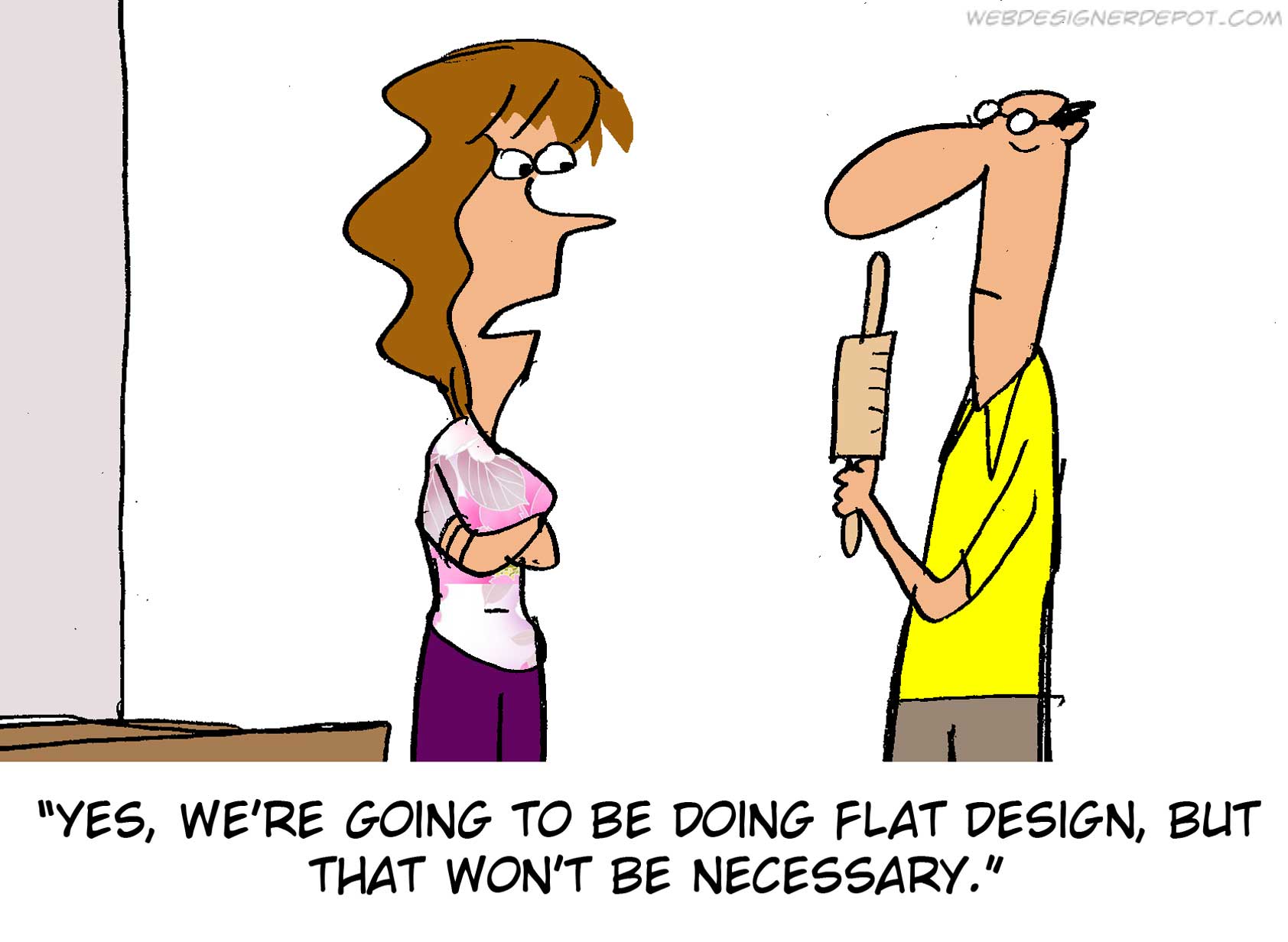
In the last 12 months we have seen a definite shift away from this, and more towards flat design techniques. This means using block colours and simplistic layouts to give a minimalistic, 2D appearance (not rolling pins!).
 Source: Web Designer Depot
Let’s take a look at two examples of flat website design from the DBG website portfolio:
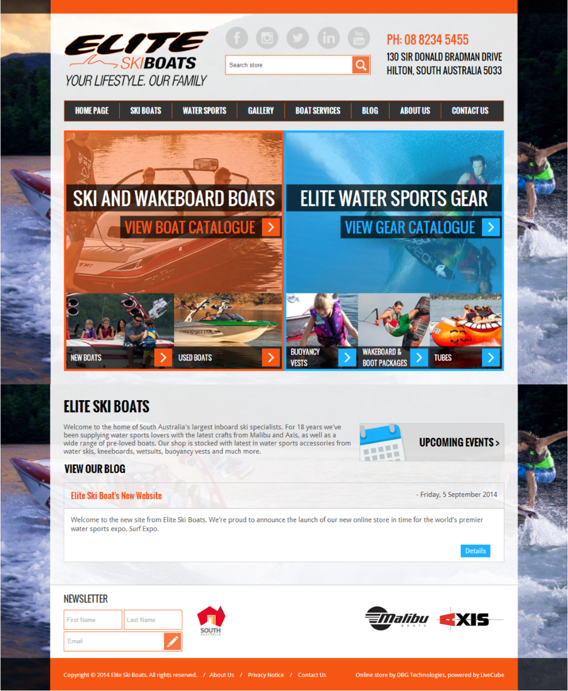
Elite Ski Boats
The Elite Ski Boats website suits the use of flat design techniques because their logo is 2D in appearance. Specifically, the menu and buttons are all solid colours with no use of gradients or dropshadows to indicate clickable elements. Instead we have implemented the use of the greater-than symbol “>” to indicate an action. For example, when ‘VIEW BOAT CATALOGUE >’ is clicked, the website will load the next page.
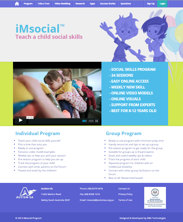
Autism SA’s iMsocial
The iMsocial project, an initiative of Autism SA, suits the use of flat design because their colour scheme is based around bright, solid block colours. Users know when they have moved over a clickable elements – like the menu – because the site has been coded to use ‘rollovers’. This means that when the mouse rolls over a menu item, that menu item changes colour.
While flat design is very popular at the moment, we would only encourage its use when:
1. If it fits within your overall branding guidelines:
If your logo is ‘flat’ and other branding elements or secondary graphics feature no gradients or shadows, then extending this into a flat website design would be suitable. Don’t try to force your brand to fit this new trend if its not supposed to!
2. If it is suitable for your website target demographic.
If the majority of your website users fall within an older demographic, or are perhaps people who don’t have a high level of internet experience, then flat design may not work well for you. These types of people generally need things like buttons or other calls to action made more obvious through the use of gradients and other 3D techniques.
Let us know in the comments if you’ve seen any good (or bad) examples of flat website design, or contact DBG today to discuss whether flat website design is suitable for your business or brand: www.dbg.net.au


